What is a font?
In general terms and at a social level, we understand typography and font as the same concept, But it really is not. It may sound technical but they are different and it is interesting to know this difference, at least to add to our editorial knowledge.
Technically, typography is design while the font is how that design is distributed and used, that is, the design is unique and has a name with which we identify it: Helvetica or Times New Roman, this is what we consider a font. On the other hand, when we put that Helvetica in Light at 20 points or in Bold at 45 points, for example, we are talking about two different fonts, belonging to the same typography.
font types
The reality is that there are many types of typography, especially depending on who you ask, although it is true that in general we usually talk about four basic categories:
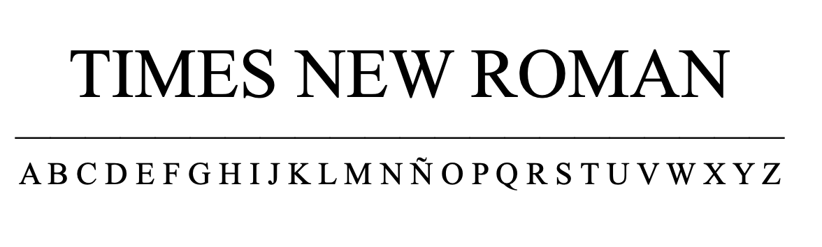
Serif
serif or serif typefaces are the most classic and ancient. They are usually used for printing and publications, since these tend to have a lot of text and the serif allows the eye to read faster. In addition, they are the most used in books, newspapers and magazines, since they give that classic, serious or traditional touch.
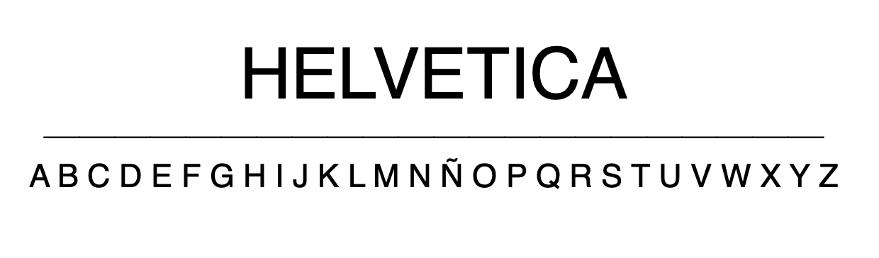
Sans Serif
the fonts Sans Serif, which literally means without serif, which are also called palo seco, are the fonts that emerged from the avant-garde. They are the most modern and simple. They tend to look cleaner, so they are often used for reading on screens, since the Serif can become distorted on small screens. The dry sticks are the most advertising and modern typefaces. Widely used also on websites and in advertisements.
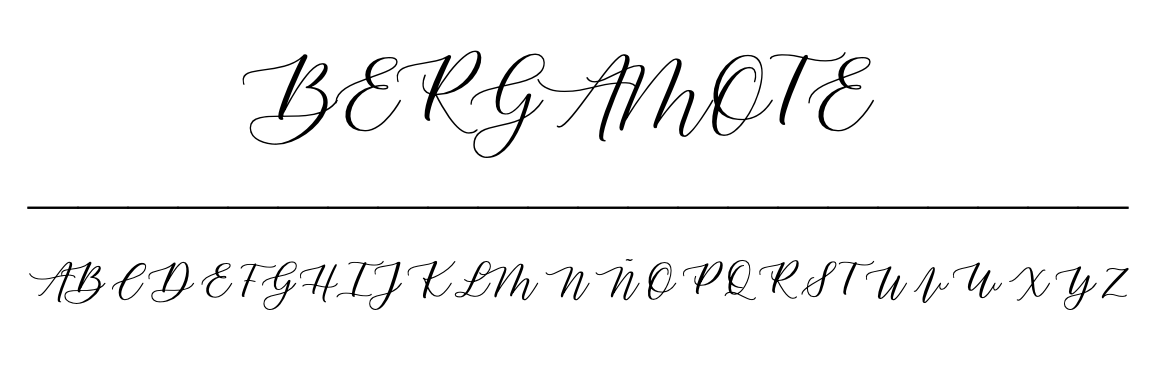
Script
the fonts script pretend handwriting. The most formal ones tend to imitate the letters of writers or are generated with the beveled tip of a pen with thick and thin strokes. There are people who even make their own typography with your writing with imperfect and variable paths. Calligraphic typography has almost no limits and is widely used for weddings, advertising, titles..., but it is very rare to see it in text bodies.
Decorative
Decorative typefaces are those that have, as their name indicates, a display function and its main objective is to attract attention. They usually have a specific effect or purpose and should not be abused.

The importance of choosing a font
Once we have understood what a font is and we know the main types that exist, it is time to define how it can be choose a correct typeface according to the project to which it will be used.
Typography provides information about the project or the person who uses it, such as how to choose the color of a car or the clothes to wear, everything has a meaning no matter how intentional or not. But, logically, what is interesting is know those meanings and use them in favor of the project.
Generally, everything provides an impression at first sight, and typography is no less, at first glance people can arrive assess and judge the rest of the design without even having seen it complete. So you're doing editorial design, graphic or visual compositions, the decisions have to be appropriate and intentional.
As an example: If you want to sell a trip to the Maldives, it is not the best idea to use the most serious font out there, but rather a fresher and funnier one.
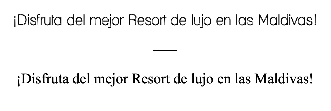
Some characteristics that the chosen font must have are: versatility, readability and context or suitability. The versatility It can be defined as the ability that a typeface has to adapt or adapt to the needs of the designer, for example, that you have several types of fonts (bold, light, regular, thin…). The readability It involves different factors like size, spacing, font height, etc. And finally, the suitability you should answer yes to the question does it work with design context?
There is also the possibility of combine fonts that complement each other and that are not very similar but that do not clash with each other either. In general, serif and sans serif tend to be combined between headlines and body text to give more dynamism, but that depends entirely on the designer.
How to find fonts
Finding fonts that are different from those that are preset on the computer may seem like an extensive and expensive task, but the reality is that there are many platforms that have many fonts and typefaces Available for free download and use. Some of them are Google Fonts, DaFont or 1001 Fonts. In general, all these websites offer Options free, but keep in mind that some may have a license of some kind, that is, although they can be downloaded for free, you must read the conditions carefully, because sometimes they are only for personal use and other times for commercial use.